Paper Seraglio
  • Home
  • THIS LAND
  • e-books
    • A String of Momentary Silences
    • Do Unto Others >
      • Do Unto Others - Chapters 1 & 2
    • Daisies of Mars
  • WiPs
    • Raw Flesh in the Rising
  • Ocean's Edge Editing
  • Sites to Know
    • Duotrope
    • [Places for Writers]
    • Brevity
    • The Puritan
    • Ditch
    • Cornerbrook.net

Help me Choose my Cover

8/28/2012

4 Comments

 
Picture
I'm only about a third of the way through a piece I'm working on, and as I plan to publish it on Amazon in a shameless display of artistic greed -- those artists, buncha money-grubbers -- I've jumped the gun and designed a few book covers.

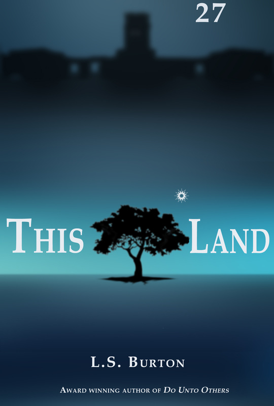
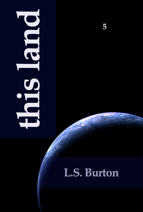
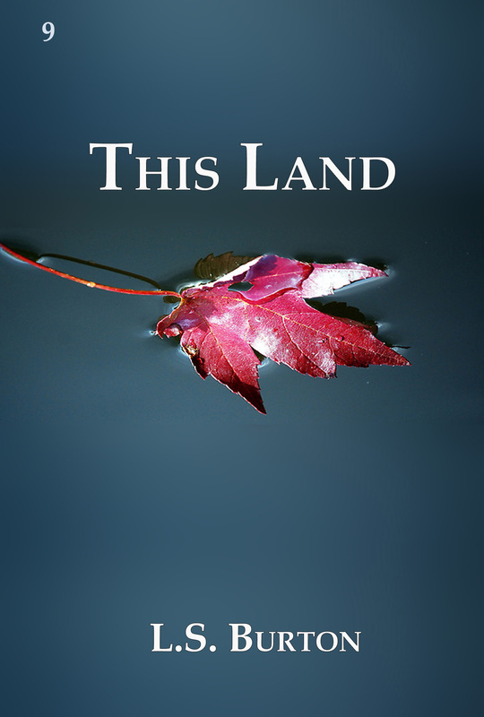
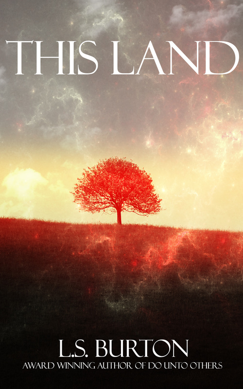
Okay, actually I've SERIOUSLY jumped the gun and designed 27 book covers. In penance for my gluttony, my punishment is to not-so-proudly display the first cover I tried to make here on the right.

Just look at it ... mocking me.

In truth, though it's awful, I'm actually not that put off by it. I had to teach myself how to use Photoshop. My talents are limited by not knowing what the majority of the buttons actually do.

So I turn to you, the popular eye of the populace. I could really use some opinions and feedback. I'm out of ideas and, frankly, tired of photoshop. Time, then, to choose!

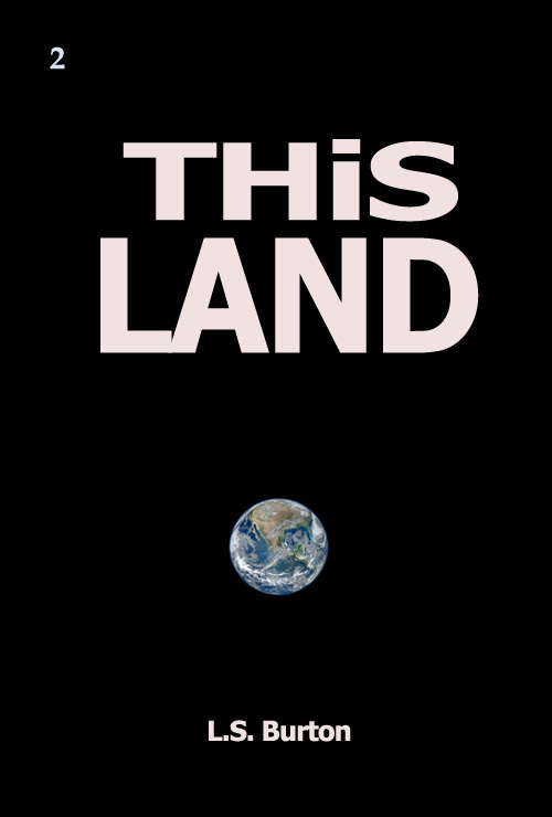
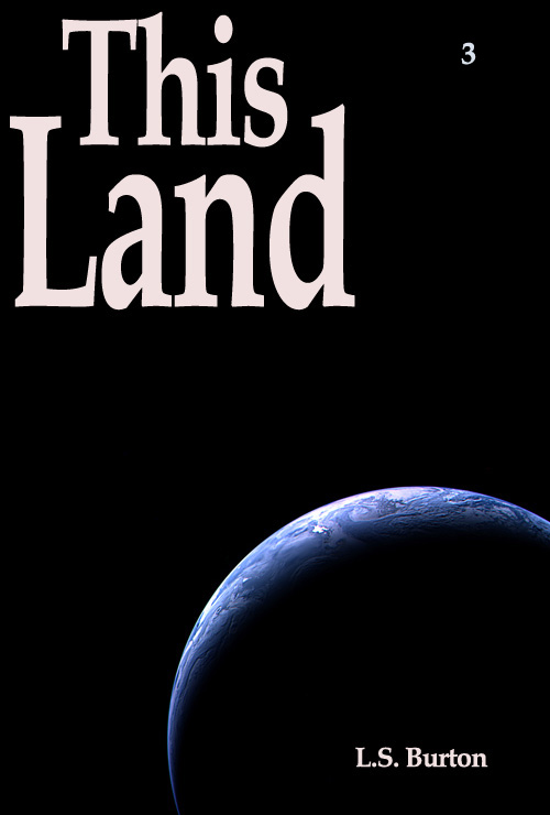
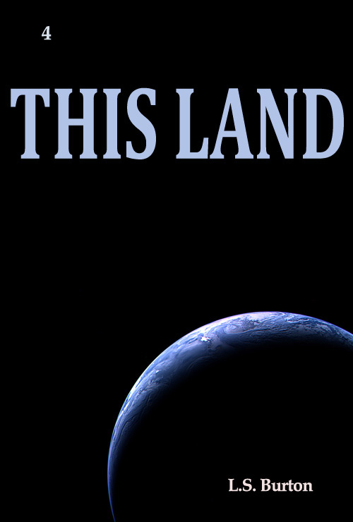
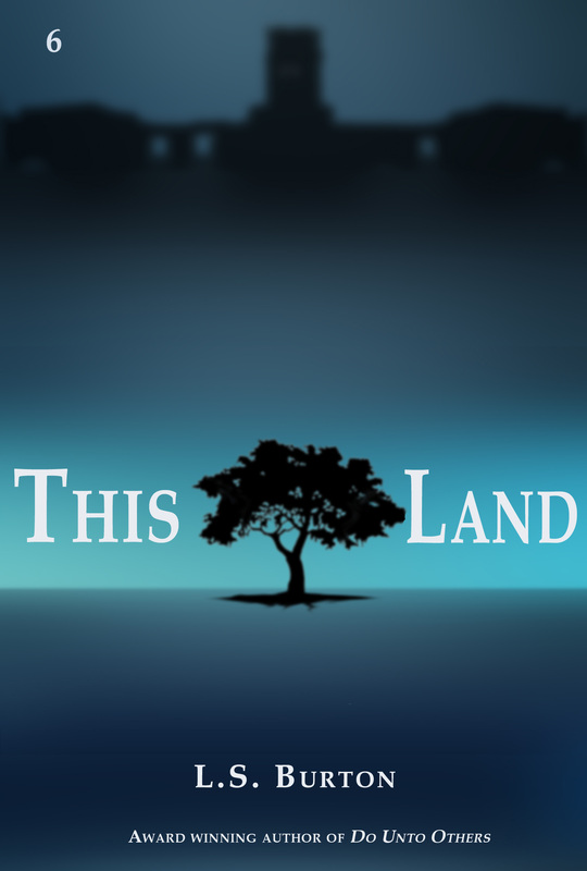
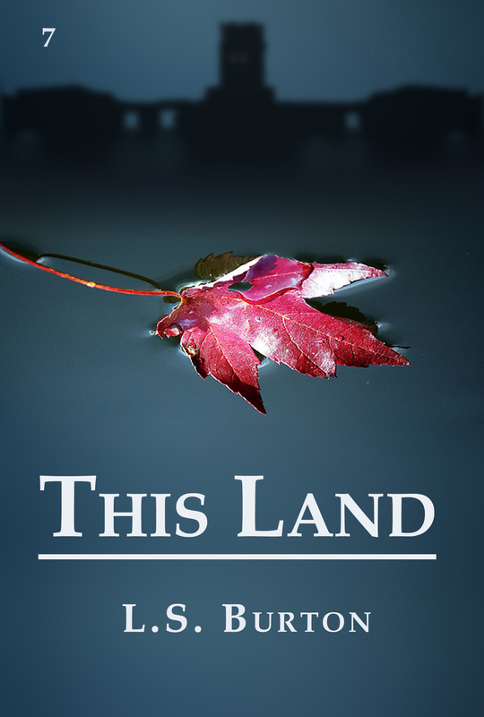
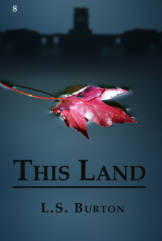
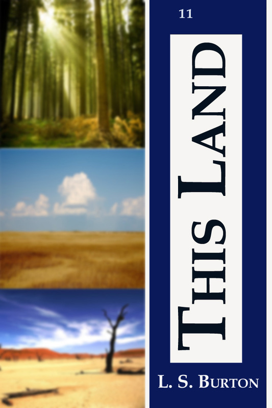
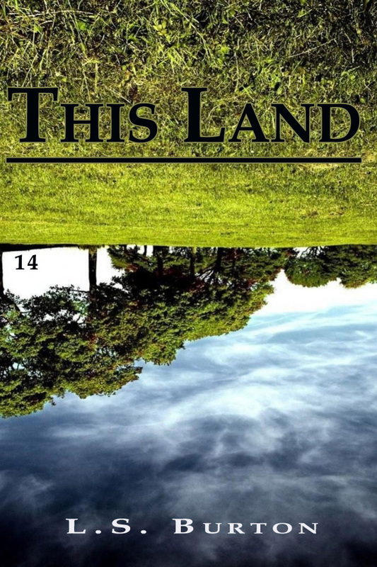
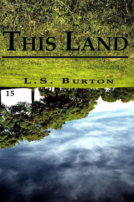
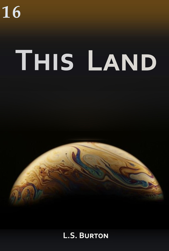
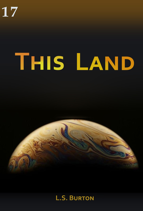
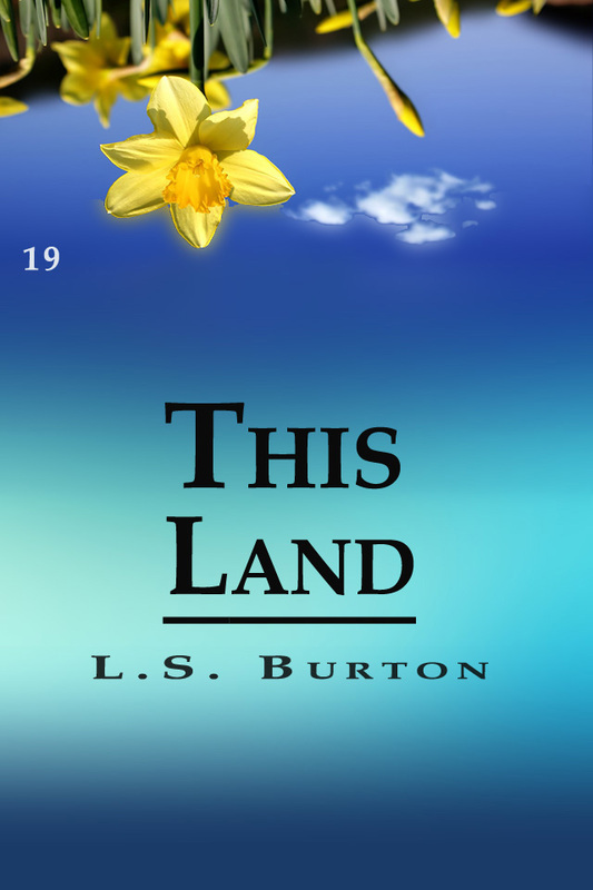
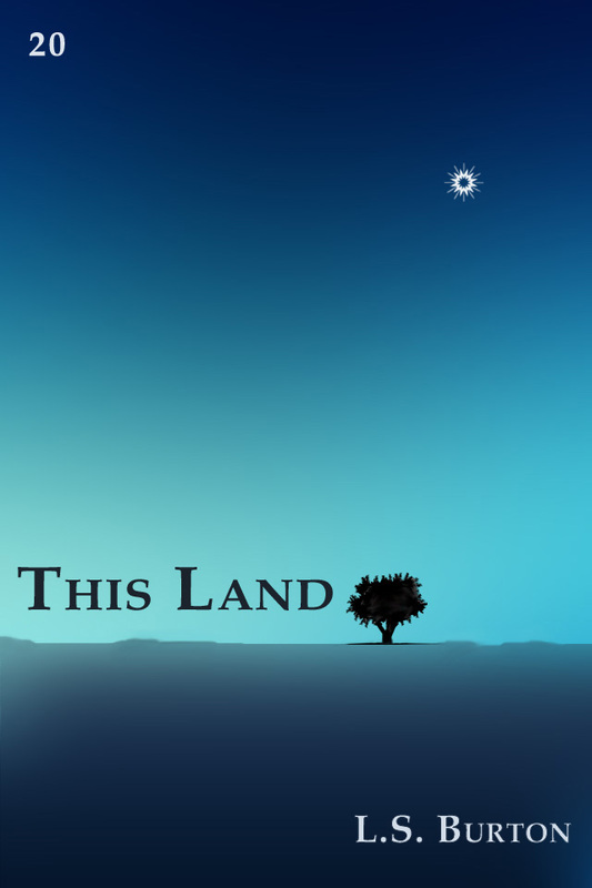
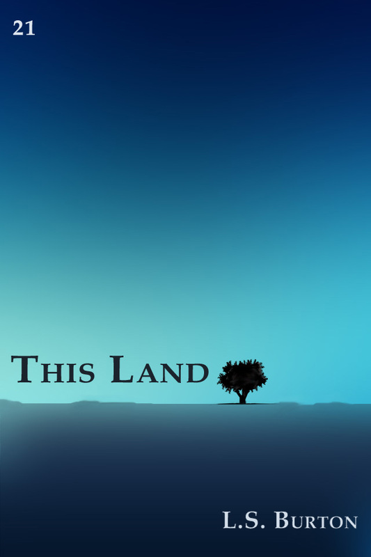
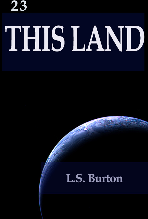
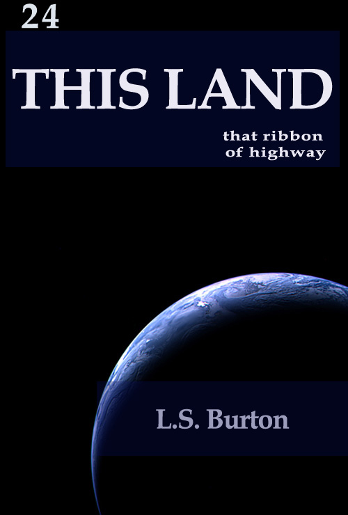
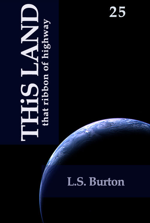
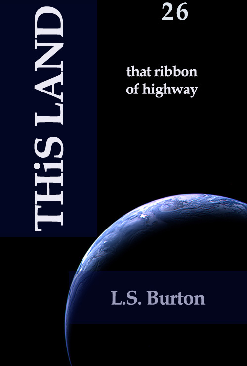
Okay, so, without further ado, my story is a SCIENCE FICTION/ HORROR  INVASION story. Bear that in mind, please.  A new star appears in the sky, bad things start happening, and people hole up in an ancient crumbling monastery. That's the basic plot.

Fonts can always be changed.

Any feedback you could give me would be greatly appreciated.

With heartfelt thanks in advance.
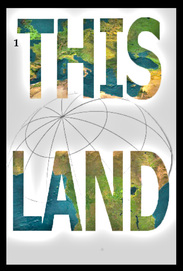

4 Comments
Anu link
8/28/2012 06:30:38 pm

Hey, I enjoyed them all, they're very nice. The planet picture in numers 3-5, 23-26 best conveys the sense I got from your description and captures the genre best too, the sense of emptiness typical of most sci-fi covers. I wasn't perfectly happy with the layout of any of them, but number 25 came closest. The rest of the covers are fine (except 11 and 12 that are too busy), but combined with the title they give me a notion of an environmental essay. Of those covers, number 20 is best, but perhaps the planet in the sky (or is it that?) could be a bit larger so that the sense of extraterrestial is clearer. That one has a very good layout overall too, althoug I would crop the picture so that the tree is more to the right (it's a bit off balance now). I would perhaps go with that, as long as the genre is made a bit clearer.

I hope these comments were at least a little helpful. It's never easy to have outsiders tear at hours of hard work. :)

Anu

Reply
Lee
8/29/2012 02:45:20 am

I appreciate the input. The more, the merrier. Getting criticism is the nature of the industry, so no worries there. It's only bad if I ignore it haha

Reply
Linda Pressman link
8/29/2012 02:58:08 pm

First of all, I really like your first cover even though it's not finished, etc. The letters, made up of earth-appearing colors, are what I tried to describe, through about 50 revisions, to my designer with no success, except mine was with clouds. As far as the others, I like #2 because I think it conveys some of the desolate feeling of what you've said of the story, except I'd probably try to get that star in the black sky above the earth. One note: it's "hole" up in a monastery, not hold up. :)

Reply
Lee
8/30/2012 06:39:50 am

haha, Thanks for the correction, Linda. Really. I wondered that at the time, but it was 3am and I said 'good 'nuf' and went to bed.

Having the land inside the words was my first thought, and first choice. I made the image in photoshop using a tutorial about the 'Clipping Mask.'

I believe I used this page: http://graphicssoft.about.com/od/photoshop/ss/Image-Inside-Text.htm

Too bad your designer seemed a bit dense. Maybe that'll help you some in the future.

Thanks for the input. Much appreciated.

Reply


Leave a Reply.

    L.S. Burton
    PictureFarewell, third person bio.


    Lee Burton doesn't have cats or kids, but he does have a lot of books, a couple of mugs he thinks are really fantastic, and a good pair of shoes which haven't fallen apart yet despite his best efforts to murder them with kilometers.

    Burton has written almost six books. Almost six as some are still scantily clad in their respective drawers. Each of them had their own goals and were written differently, and he is very fond of them all -- except perhaps for his first attempt at a novel, which remains a travesty.  That one he keeps locked in a dark basement and feeds it fish heads.

    In 2011, Burton won the Percy Janes Award for Best Unpublished First Novel in the Newfoundland and Labrador Arts and Letters Competition for his novel Raw Flesh in the Rising.

    And just recently, in the fall of 2013, Burton published his first science-fiction novel, THIS LAND, about which he boasts constantly.

    Available at Amazon

    Picture
    Click for reviews.

    Picture
    Read an exciting excerpt.

     Store


    Now Free
    on Paper Seraglio

    Picture
    Click for your own copy.
    Tweets by @PaperSeraglio


    Goodreads: Book reviews, recommendations, and discussion

    Archives

    March 2014
    February 2014
    January 2014
    October 2013
    September 2013
    August 2013
    July 2013
    May 2013
    April 2013
    March 2013
    February 2013
    January 2013
    December 2012
    November 2012
    October 2012
    September 2012
    August 2012
    July 2012

    Categories

    All
    Anthropology
    Article
    A Thought
    Attempted Wit
    Book Covers
    Books
    Ebooks
    Excerpt
    Funny
    Grammar
    History
    Interview
    Literary
    Lovecraft
    Newfoundland
    Popular
    Published Piece
    Saturday Showcase
    Science
    Science Fiction
    Short Story
    Systematic Rube
    This Land
    Video
    Writing


    Special Thanks to:

    Picture

    Picture
    Percy Janes 2011
    Percy Janes Official Contest Excerpt
Powered by Create your own unique website with customizable templates.