Today I was directed to a Tumblir site making fun of Bad Book Covers. Or, as it says, lousy book covers. Trolling through them however, I thought a few of them simply didn't belong. To me they seemed homages to the science fiction book covers of the 1960s and 1970s.

I read it for the articles.
Which, in my opinion, are great.
Make no mistake, I'm well acquainted with those. On many occasions I've come across books -- often wonderful critiques of society as a whole, great anthropological fiction, or early thought-experiments on how technological society is changing us all -- that I've simply been too embarrassed to buy because of their covers.
I couldn't bring myself to hand the book to the clerk and say, "Yes, I am interested in purchasing this. Here is real money."
Heinlein's Friday comes to mind immediately. Many times, while delving deep into second-hand shelves in tiny bookstores in small towns in northern places, I came across this book, and always considered buying it.
But nope. Never did. Probably never will.
Heinlein is famous for his space floozies, as I'll try to demonstrate below. Some of his books should have come in brown paper bags.
I have a number of examples of interesting old book covers, but science fiction covers of the 1950s, 60s, and 70s, seem to epitomize a certain way of thinking.
Essentially, the way I see it, many science fiction publishers didn't take their own genre seriously. When it came time to produce covers for what often became classic works of the genre, this is basically how I imagine their line of thinking went:
QUESTION: Who reads science fiction?
ANSWER: Adolescent boys.
QUESTION: What do adolescent boys like?
ANSWER: Spaceships. And girls.
ANSWER: Adolescent boys.
QUESTION: What do adolescent boys like?
ANSWER: Spaceships. And girls.
| Nothing else. That's it. So what followed were a lot of books that combined the two, often inelegantly, and in go-go skirts, while sort of ... flying through the cosmos. Usually, much like Friday, I couldn't coax myself into buying the more flagrant offenders, but I still have a few fine examples of: | Please pardon the quality of some of the pictures. I was learning how to use a new camera. |
__Space Laaadies__
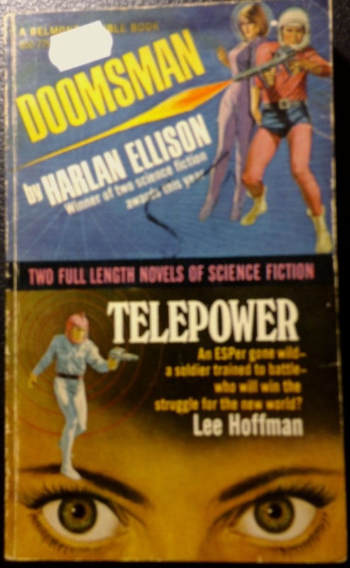 Ellison is known as an inspiration and often too-unrecognized innovator. Yet here we have the tight purple jumpsuit damsel. |  Half the pages were stuck together when I bought this manifestation of Heinlein's creepiest fantasies. | 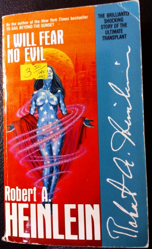 Heinlein, I'm pretty sure, typed this book using only one hand. |
Mind you, the male 'hero' in the Ellison cover above is also wearing short-shorts over a pink unitard, and what appears to be a motorcycle helmet on his head. All too often, I think science fiction covers of this era were a reflection of what could be achieved at the time by television and film special effects.
Heinlein received a lot of credit with me for Starship Troopers, which slowly dwindled away as I read more of his catalogue. The last of that expired halfway through I Will Fear No Evil, which has the plot complexity of low budget pornography. I put it down mid-paragraph and I've never looked back. Since then, even telepathic nazi Doogie Hauser and the cast of Saved by the Bell in Space versus the alien bugs has been regarded leerily.
 Two, two tiny humans. Ah, ah, ah.... |  In this Heinlein cover, the ladies are, literally, all over him. |  Frank Herbert wrote the classic, Dune. His publisher said, "Hmm. You need more nekkid ladies." |
I don't recall much about the plot of The Heaven Makers, but I remember enough to know that the cover hardly relates to the book at all. The damsel on this one is rather small, but of course wearing some lovely low-cut evening wear. I always thought the fellow with the cool curvy sword meant to defend her from what appears to be Sesame Street's the Count's close family, but upon closer inspection it looks more like she's running towards the nearest of their captors, and he's getting ready to cut her down.
Just another day at Gringotts.
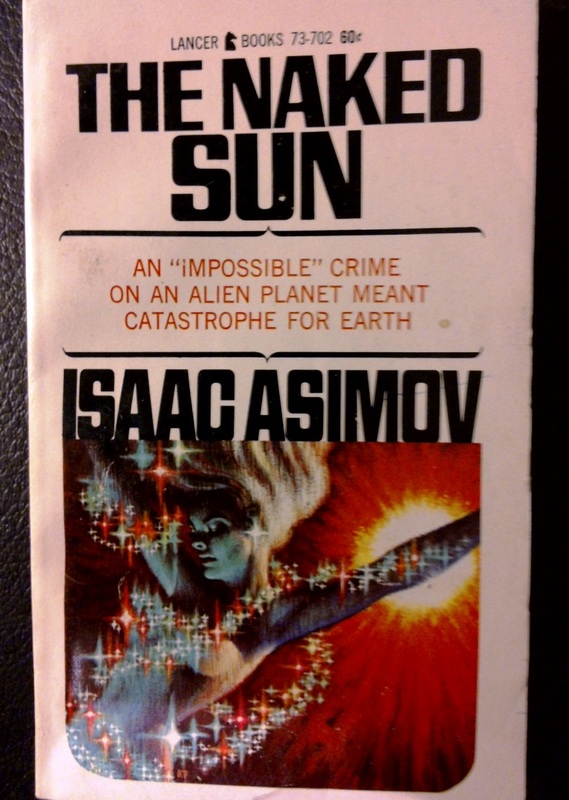
Of the next two, the Asimov cover is my favorite example of flying space ladies. The publisher just couldn't resist playing up the word 'naked' in the title. As you can see from the Wikipedia entry below, just like all of Asimov's titles -- especially his annoted version of the bible -- the book is a filthy, perverted space romp:
As shown in its predecessor novel, The Caves of Steel, Earth also appears to have evolved an unusual society, in which people spend their entire lives in confined (or "cosy") underground interlinked cities, never venturing outside. Indeed, they become utterly panicked and terrified when exposed to the open air and the naked sun.
Asimov, being brilliant, predicted World of Warcraft by fifty years.
 I'm an 80th level paladin. With sparkles. |  Not defending this one. Early 80s. But there were no flying space elves, I assure you. |
__Space Ships__
The other side of that equation, of course, is the space ships. These days, this popular sort of future-ism is sort of a -- ironically -- nostalgic art form. Here's a great page of spaceship conceptual art.
Many old book covers from the 50s, 60s, and 70s, are fine examples of the art that spawned the genre.
Many old book covers from the 50s, 60s, and 70s, are fine examples of the art that spawned the genre.
 A 'modern' pilot travels in time with his silvery jet plane to show bad guys with crappier silvery planes how he shoots down crappier silvery planes. |  The gift is some kind of kitchen labor-saving device. |  Again, I don't remember this being in the book. But, buying it, I felt safe the book hadn't been pried out from beneath some 12 year old's mattress. |
I'm not quite sure what's happening in the covers below, but it sure is 'spacey.' I've noticed that Niven's name tends to get a little heavy around the middle.
 Look out, translucent space guy. Here come the techno space dolphins. |  Orbs are sciency. Looking closely, the man is wearing rather high green space boots. | 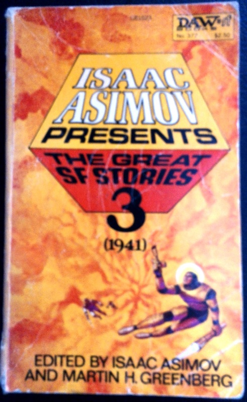 One can't forget the early adventures of Buzz Lightyear. |
 I, Robot is a book of short pieces about the integration of human-like robots into society. This is what humans look like, right? He'll blend right in. |  I really like this one. Such a simple design, and just a great example of a classic cover. Also, I really like space ships. And girls. |
John Berkey's work is generally considered classic these days. With a little digging, I've learned he designed the I, Robot cover above.
Chris Foss is the designer for the Foundation cover, which is also a good early example of orange-blue constrast.
Older John Wyndham's books usually have classic examples of space ships and sciency stuff as well:
 |  |  |
Some of his more recent editions, however, disappoint in that they attempt to portray what the reader could expect from THE ACTUAL BOOK. I guess that's the Penguin influence.
 Evil sciency skull spiders. |  Evil sciency plants. |  This one, mind you, still puzzles me. Are those American flags inside the ... boosters? gun barrels? |
__Salacious, Naked Beats, and Soft Lighting__
Now there' s a heading that demands attention.
I've always loved Jack Kerouac. Cliche, I know. I don't care. I love his writing. That everything he published, with the exception of The Town and the City, is a first draft still blows my mind.
Don't try this at home, kids.
When he exploded on the scene back in the 1950s, it was a turnaround for established literary circles. Sure, he wrote like jazz, like closing your eyes and seeing colors, but he wrote about youth and adventure, often in a free-spirited, devil-may-care manner. It was a mainstream embracing of counter-culture.
The first edition of On the Road is a rather severe, classy, black cover, a cover that goes to church on Sunday and hardly ever says swears. These paperbacks, however, seems to be pushing another angle altogether. I only have three old Kerouac paperbacks, and I have five nekkid ladies.
 Kirk and Ohura, the early days. |  Just hanging out atop some furniture, fostering an image. |  A nostalgic book about his high-school crush? Or what literally appears to be a roll in the hay? |
Ladies and gentlemen of the 1960s, buy these steamy paperbacks to find out what your kids are doing: posing nekkid with strange floating houseplants. Mind you, come to think of it, the cover for The Subterraneans was probably pretty risque for the time (1966).
By 1962, John Steinbeck, another of my favorite writerly gentlemen, had a Nobel prize. Win that kind of recognition and your covers begin to take on a friendly, earthy atmosphere, lit with a soft glow.
 Steinbeck's classic retelling of the 2012 NHL lockout. |  |  |
Of course, every once in a while, even Nobel prize winners get the nekkid lady treatment.

Also, the ship looks like a face.
__Wells, Wells, Wells ...__
From these next three, I take the lesson that if your work survives long enough to be recognized by pretty much everyone, your publisher may actually read the book and okay a cogent cover.
 Of course if you're a futurist who predicts we'll be attacked by spaghetti and meatballs from Mars ... | 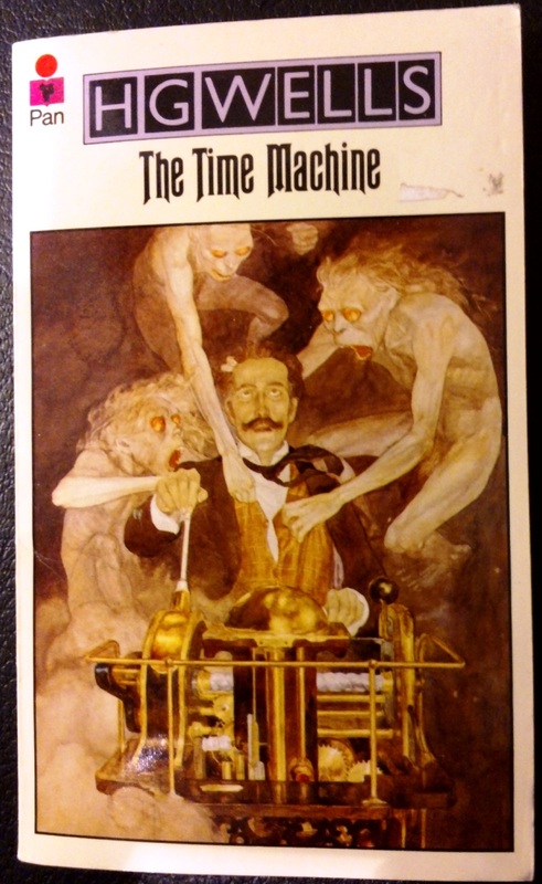 ... sexually molested by white monkeys ... |  ... or ever look so proud while wearing padded shoulders ... |
... well, we can't help you there.
__Power Font__
LARRY NIVEN WANTS TO PUNCH YOU IN THE FACE WITH HIS TITLES!
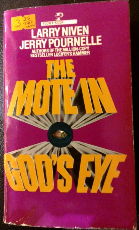 | 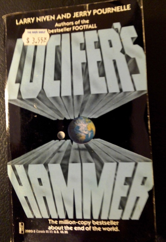 |
The cover designer for these bad boys had heavy metal in his soul. These are covers that head-bang to Black Sabbath, that have Slash on speed dial. In truth, Lucifer's Hammer probably shouldn't be included in this list as it's a little too new. Yes, it was first published in the 1970s, but this edition was published in1993.
Essentially, I'm pointing out that this sort of thing has been going on for quite a while now. And it needs to stop.
Seriously. Stop it.
Also, it's a really good example of how book design gets recycled.
__A Huzzah For the Rest__
I think for any other author, these two covers would be laughably cheezy, but for Lovecraft they're absolutely perfect.
 Of course it's a frog Nosferatu. Why wouldn't it be? Alternatively, now the Grinch has come for Halloween as well. |  Here we see a diagram of Darwinian evolution. |
On my shelf I discovered these great 1960's paperbacks of The Aeneid and The Iliad that I never knew I had. Any designer these days, with current trends in book covers in mind, will tell you that the Iliad cover is too busy, potentially has too many colors, and not enough empty space to draw the eye to where you want it to be. I think that's unfortunate. Because this cover is fantastic. I'd hang that on my wall.
 |  |
 A fine example of the cover designer having read the book, but this time actually getting it right. | 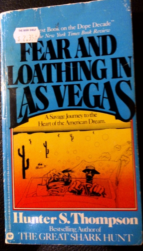 The illustrations are almost as good as the book itself. |
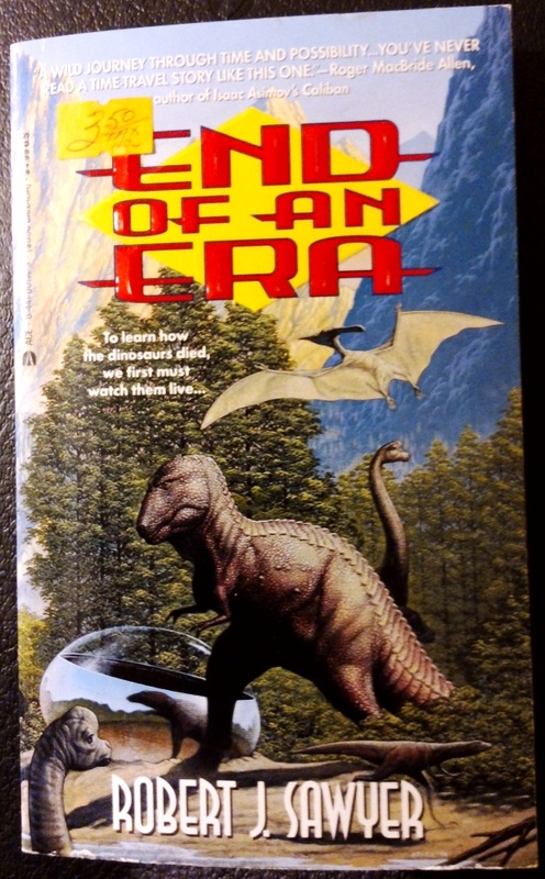 An early book by acclaimed Canadian SF writer, Robert Sawyer. I'm assuming he tried to destroy all copies of this cover once he became famous, and I happened to find one of the last remaining. |  A fine example of when it would probably have been better if the cover designer hadn't read the book. |
 George Clooney's summer home. |  Believe it or not, this cover suits the book perfectly. |
And with that, I'm out of my best examples of fun old book covers.
Not exactly an anthropological study, but a fun visit through the furthest antipodes of my bookshelves. Sad to say, but with e-readers gaining more and more widespread adoption, it won't be much longer before nostalgic digs such as this one become virtually impossible.
Okay, now I have armloads of books stacked on my desk that I need to reshelve. Hope you enjoyed.
Okay, now I have armloads of books stacked on my desk that I need to reshelve. Hope you enjoyed.